Any web site will have a colour scheme – either the default provided by the browser, or one chosen by the designer. The selected colours will determine text colour, active links, followed links, possible headings etc also.
Choosing colours for a web site is made more complex if one takes into consideration the needs of colour-deficient users. This page offers some guidelines to designers, so they can apply their design skills in the context of the limitations inherent in the problem.
Click on any of these images for an enlarged view.
Simple schemes
[ or see Grouped colour palette, Alternative selection palette or Example palettes ]
The simplest approach to selecting a colour scheme is to limit oneself to only 3 or 4 colours (in addition to black and white), using a primarily monochromatic scheme. Differences in tone, if reasonably substantial, should be discernible by all.
Choose a base colour for the main scheme, and find one or two other shades of the same colour family to tone with it. Determine whether the selected colours come from the yellows group (generally warmer colours) or the blues group (cooler colours). Make sure that the chosen shades contrast enough to be readable when used as text on top of another shade, or on white.
Then select an accent colour (as may be used for followed links) from the ‘other’ group of colours.
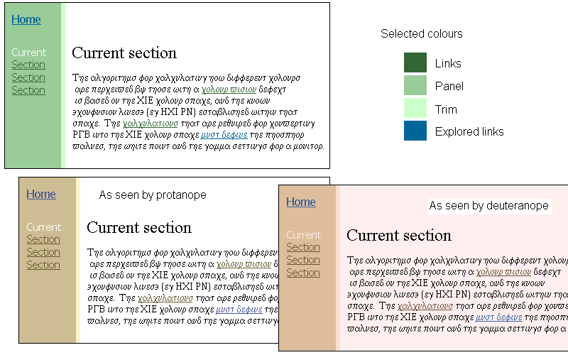
For example, a light green can be chosen for the navigation panel, perhaps with the addition of a lighter shade for edging. Text can be done in a darker green which is dark enough to contrast with either the light green or the white background.
The greens translate to shades of yellow/ochre/brown in the transformed palettes, so for an accent colour choose a shade from the blue side. When using colours for text links, choose from opposite sides of the palette to indicate followed and unfollowed links.
Figure 1 – Example choice of colours, and relative appearance for Dichromats
Grouped colour palette
[ or see Simple schemes, Alternative selection palette or Example palettes ]
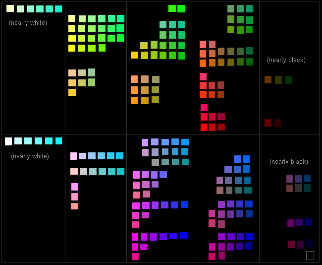
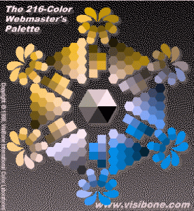
The web-safe palette has been divided here into two colour groups, according to the main confusion groups of colour-blind users. These will be referred to as the Yellows group, and the Blues group. Several colours go to neutral, rather than blue or yellow, but I’ve redistributed them into the first two groups, for simplicity. Each of these groups has been subdivided into columns, according to the apparent luminosity levels of the colours in the transformed palettes (not the standard palette). These are the colours likely to seem very similar, in both colour and luminosity.
For colours that need to be differentiated, ensure there is at least one column between the values. For large areas of text on a coloured background, aim for three columns between, generally. Colours used for ‘trim’ or accents do not necessarily require the same degree of differentiation as the colours being used as visual cues. If you test the choices you’ve made by using the transformation palettes, you’ll see whether the colours are safe to use together.
Figure 2 – Image table of colours grouped by luminosity of the transformed values
As in any design project, there will be a level of trial and error in making one’s selections. This palette is intended to help to simplify the selection process, and reduce the number of iterations, but is still far from automatic.
Alternative selection palette
[ or see Simple schemes, Grouped colour palette or Example palettes ]
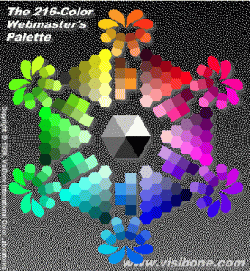
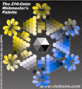
Bob Stein has created an interactive version of the web-safe palette, allowing one to select a number of colours to see how they work together as areas and with text. When translated to the protan and deutan versions, it offers a very clear comparison of the colour groupings and probable confusions. Figure 3 shows his palette, alongside translated versions. Click on one to open it in a new window, to use alongside the Color Lab.
Figure 3 – Bob Stein’s Color Lab layout, with translated equivalents
Example palettes
[ or see Simple schemes, Grouped colour palette or Alternative selection palette ]
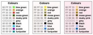
Figure 4 and 5 show example selections of colours for particular applications. Figure 3 was for an application that needed to have 10 distinguishable colours, for small objects which were grouped by colour parameters represented by colour. Note that one would not normally use so many colours within an interface, especially not for navigation, as it is difficult to ensure that they have a great enough luminosity contrast. Graphical data display is an exceptional situation, and user control over the total number of colours used is an important feature of the example given.
Figure 4 – Sample selection of 10 distinguishable colours
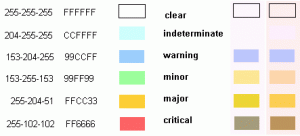
Figure 5 was a selection of colours for a system requiring alarms. Note that the clear state has no colour (reducing the total number) and the indeterminate is nearly clear. The shades were chosen to enable black text to also be readable against the coloured backgrounds, and to reduce strong contrasts.
Figure 5 – Sample selection of colours for a set of alarms
